Tuesday, March 12, 2013

Sony Xperia Z Review

Boy, it's good to be back.
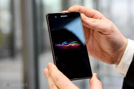


For several months nothing interesting happened in the world of Android - but come 2013, and I can barely keep up.

Today I present my review of Sony Xperia Z, the latest flagship from, you guessed it, Sony. This phone has elicited a polarising opinion from the internet. Unfortunately, while most tech sites I visit have apparently come out of their contracts with Apple, now they seem fixated upon HTC and Samsung. In turn, Xperia Z is receiving very, very unfair coverage from the internet. I am here to set that straight.

See, I've had the Z for a few weeks now, and I know how it is to use every day. You won't find such a review elsewhere on the net. Try it.

So, at the start of 2013, what do you expect from a flagship Android phone? High quality build, stunning design, reasonable battery, card slot, high-falutin' camera, and top notch software, right? Well, Z delivers on every one of those counts.

HARDWARE
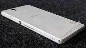
The phone is gorgeous. Made of gorilla glass (glorified plastic, make no mistake) front and back, it is one square slab which is also very thin. While the Net is busy singing praises of HTC One's curved back, aluminum construction, and fancy strips, it ignores several ergonomic nightmares going on with that device: a power button placed on top, and two capacitive keys below the display mapped to perform FIVE functions meant to be performed there : home, back, multitasking, menu and Google Now.

The Zs power button alone is a masterpiece. Big, round, it nestles squarely in the middle of the right side, it is placed so that when you hold the phone, your index finger ALWAYS strikes it. That means you can use the power switch without moving the phone an iota. Beat that, HTC.

Being waterproof (I know, I tested it), all the phone's orifices are covered with flaps. It's a mild irritant, but it pay off when the phone will have smudges and you will be able to place it under the tap without a care in the world. The phone also seems to be remarkably, remarkably resistant to scratches. Despite dropping it thrice on the floor, I have yet to see a single scratch or mark. Trawling the forums, I learnt that Sony have placed protective plastic sheets over both the front and back. That is in addition to the 'normal' protection.

A 5-inch screen device will always have some inconvenience to it. That is the case here, too - forget about being able to reach all corners of the screen with your thumb. However, the placement of the power button, and the solid (if a little painful) grip provided by the squared off sides mean that chances of the phone slipping away from your grip are minimal. The text, pictures and other stuff on it are gorgeous. The only slight problem is that it's not as bright as others in the competition, and its viewing angles are not ideal. Being a TFT LCD, it's said to be a bigger battery hog than super AMOLEDs and super LCDs used by Samsung and HTC.

That said, this 'problem' fades away while using the phone. You don't really miss the extra brightness of SLCDs or saturated colours of SAMOLEDs. All you are aware of is the pixel-perfect text, accentuated by the thin fonts used by Sony.

SOFTWARE

For me, this is the area where the Z shines most. While it launched with only Android 4.1, the best thing about it is that it sticks close to stock Android. The soft keys at the bottom are present and correct, and so are Google's swipes, slides and pinches that form the core of stock Android experience. Sony's skin is gorgeous, understated and elegant - at no point in time does it get in the way. The apps you fire up behave the exact same way as stock Android - no big fonts, ugly icons and swathes of black space on top (TouchWiz), or a wide strip at the bottom sporting the lone menu shortcut (Sense). The UI doesn't have to content with a lack of keys (HTC One), or an awkward placement of capacitive keys (both One and S3). It is Android, pure and simple.
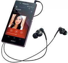


Sony's media apps (Albums, Walkman, and Movies) are surprisingly capable. Not only are they better looking than stock Android counterparts, but they are functional in most surprising and pleasant ways. Downloading album art, or information about movies on your device, is a click away. Streaming to or from a network PC or PS3 is also just a click away. No need to install separate apps.

Watching movies on the Z is a revelation - I honestly enjoyed it more than our HDTV. The clarity is unsurpassed - this is where the 1080p resolution shines. The sound through the single speaker is pathetic though - the sound through headphones is again, outstanding.

The Z's camera should be great on paper - what with the Exmor R sensor and the much-touted 13 mp resolution. However, I will caution the readers: think of it as your routine cameraphone. It's nothing more than that. It also takes ages to launch - that's maybe the one biggest complaint I have against the Z. That said, I am very, very confident that both its speed and quality will improve drastically . The gallery app itself ("Album") is amazing in its simplicity and functionality. You can pinch in and out to alter the size of the thumbnails. All the online accounts - FB, Google +, Flickr - everything is seamlessly integrated. You almost forget they're there.

Rest of the apps work equally well. Contacts app behaves largely like stock Android one, with changed color pallete and added features. Most importantly, it supports swipes to switch between tabs.

This is the running philosophy behind Z's UI. Everything is there, provided for, in the most understated, unobtrusive manner. Take a look at these screenshots to know what I mean:


PERFORMANCE AND BATTERY

The phone runs on Qualcomm S4 Pro chipset, which, coupled with 2GB of RAM, means that it SHOULD fly. However, there are two problems: that 1080p screen and Sony's skin. Those two combine to ensure that the phone is not as smooth and fluid as Nexus 4. That said, it's no slouch, and I see nothing that cannot be fixed with some software optimization. Specifically, change the Sony launcher and you will instantly feel Nexus-4 levels of perceived performance.

Games play well - some of them stutter, but that is because devs simply haven't optimized them for double the resolution. With 1080p phones becoming increasingly common, it's a shame that hasn't happened.

The only blemish on the performance is of course, the camera app. It can take upto 5 seconds to fire up. That is unforgiveable under any circumstances and Sony should fix that ASAP.

Battery life is meagre. That is to be expected given the 2300 maAh unit and the power-hungry screen. However, Sony have included a Stamina Mode - and I am pleased to say that it works amazingly. Stamina mode allows you to specify which apps can keep operating even when the phone is in deep sleep. In real life, that means at least a doubling of battery life, which means that the phone can last through a whole day (at least). It is really, really commendable that Sony thought to enable this feature, previously only accessible through apps like Greenify for rooted phones.

CONCLUSION
So. 1080p screen, card slot, speedy chipset, Android 4.1, waterproofing, 13 mp camera, and top notch media software, glass construction. That's the stuff of dreams, and the Xperia Z  delivers. There are shortcomings, but most of them can be mitigated by a software update, which is rumored to be coming during March (to Android 4.2). Being a Sony flagship, fast updates and hackability are a given.

If you are too obsessed with the screen brightness, better wait for the crippled HTC One or inelegant S4 - otherwise, there is absolutely no reason to consider any other phone.

Also, look out for my comparison between HTC One, Galaxy S4, and Xperia Z once the S4 is released.

Friday, January 11, 2013

Nexus 4 Review: Is it the perfect phone?


So, I am back again. The last month or so was spent in a state of flux. I couldn't even bring out a December edition of 'Which Phone to Buy Right Now'. The reason was not that I didn't have the time. The reason was that the mobile market was in such a state of flux that I had a hard time recommending any phone. The month was also spent pursuing the Nexus 4.

Nexus 4, as you all know, is the latest flagship device from Google. The Nexus branding means that it will have the latest version of Android from Google (currently 4.2). Throughout the last year or so the Samsung Galaxy Nexus has won my unconditional acclaim, and it has been the phone I recommend anyone to buy if they can spare Rs30k or so (and it holds that position even now).

During December, the Galaxy Nexus mysteriously disappeared from local market. It has magically reappeared at dramatically higher prices, shooting from Rs30k to around Rs37k. Even at that price it remains the best solution on the market in absence of Nexus 4.

Ah, the Nexus 4. It is as enigmatic and elusive these days as Elvis sightings, or UFOs, or Yeti. See, Google launched Nexus 4 on its own Play Store (available in 5 countries in the world) and every batch has sold out within hours. The launch fiasco has gone down in history as maybe the worst product launch of 2012. Conventional wisdom led one to believe that LG will be throwing the set in the market through their own channels as well.

Guess what: LG's sales channels are not as wide as those of the now monolithic Samsung. Also, LG don't seem to be terribly interested in selling Nexus 4 at its very affordable price of $350k, maybe because their almost identical Optimus G (the Optimus UI and memory card slot being the only material points of difference from Nexus 4) is likely to make more margins. Whatever the scenario, it means that consumers don't have access to Nexus 4 right now.

That also means that if one owns a Nexus 4 right now, they own a rare product. Like I do. (Drumroll).

HARDWARE

Nexus 4 in the flesh is a total knockout. Its shape is wonderfully symmetrical, harmonious and elegant, with no lumps or extrusions other than the power and volume keys. The front and back both are huge expanses of Gorilla glass. The front is dominated by the stunning IPS display of HD resolution, and the back by something even more interesting: a 3D pattern that is visible at an angle.

The phone, despite weighing just 140g, feels substantially heavier. Everything about it screams quality. It has been a long time since a phone has fascinated me with its physical attributes. The last phone I recall as being bowled over by was the somewhat controversial Nokia N82.

Hold it in your hand and you will get the sensation of holding a much bigger and more substantial iPhone 4. Android fans have long ridiculed iPhone 4 and 4S for having glass backs - before learning that the flagship droid of 2012 would have one too.

The display of the phone has also attracted much controversy. I will summarize it thus: not as good as that of One X/One X+, better than anything else. Colours are somewhat washed out, but accurate, text is pin sharp and most importantly, whites are brilliant whites.

As for internals, the phone sports the fastest commercially available mobile processor on the market, Snapdragon S4 Pro. Coupled with 2 GB of RAM and vanilla Android, the phone just flies through anything you throw at it.

All in all, Nexus 4 may just be the best Android phone EVER in terms of hardware.

SOFTWARE

Given my professed unconditional love for pure AOSP Android, it may be a foregone conclusion that I will see this phone as having the best software bar none.

It's a little more complicated than that.

See, Nexus 4 ships with Android 4.2.1. The main points of difference with 4.1.1 are the revised lockscreen, photosphere camera, new camera software and...and...maybe some things under the hood. Out of those three things, I absolutely hate the first two. I can't believe what Google did to Android lockscreen. The 4.1.1 lock screen was an epitome of simplicity and cool. You unlocked the phone, below the clock at the bottom of the screen, you had a glowing circle. Slide it to the top, you get Google Now. Slide it to the left, phone, and for right, you got the camera.

Now, with 4.2.1 lock screen, if you slide the circle anywhere you unlock the screen. Slide to the right, and you see a screenshot of the camera app which transforms into actual camera. For Google Now, there is a SEPARATE, smaller circle at the bottom. And it has widgets. Now, if you are putting widgets on 4 or 5 panes of the lock screen, is it a lock screen anymore? Isn't the lock screen about having one pane so that you can glance at relevant info and proceed into the phone?


The Camera UI, meanwhile, is vastly more complicated. See, you get one circle to focus in the middle of the viewfinder, while there is one circle to the right for click, and one smaller one on the top. On clicking that, you 'activate' the middle ring, which now sports 4-5 settings such as HDR, white balance etc. Suffice it to say that this UI is hard to understand even for experienced Nexus users, let alone someone coming from another phone.

That said, the rest of the UI is simply spectacular. You won't find such a blend of elegance and sheer cool anywhere else. The colours, the fonts, the slide-based navigation convention within system apps - everything is just so refined. You can use this phone for years without the UI even once getting in your way. The navigation is smooth, the phone never misses a beat no matter how many apps you open. Everything glides in and out with a smooth animation.

The pure Android keyboard, while now much close to the commercial solution, cannot beat SwiftKey in terms of predictions and general accuracy. So you'd be well advised to invest in that.

Google Now remains amazing. I can simply say to my phone, 'locate the nearest Italian Restaurant' and it wil give me all the options in my city, along with reviews and ways to get there. It's still mind-boggling, and you never tire of it.

The camera itself is reasonable if not top of the class. The gallery app, as always, is a picture of understated elegance that has every feature imaginable, just not screaming in your face.

The power, flexibility and, if I say so myself, nerd appeal provided by AOSP Android is not paralleled by any of the manufacturer skins such as Samsung's TouchWiz and HTC's Sense. Most of the additional features they provide can now be easily duplicated via apps available on Play Store, albeit without the cumbersome UI of those skins.

Other than that, it's a blank canvas. You are free to build on it and even modify it. It's your playground, and Google won't get in your way. Even if you leave it as-is, you are still getting full-featured OS that caters to your every need, while being faster than anything else.

CONCLUSION

So. Availability issues, 16 GB limited and slightly irritating lock screen and camera app. Go ahead and blow these foibles into gamebreakers if you like, the truth is, Nexus 4 might be the best Android phone available at the moment. Forget your Galaxy S3's, Notes, or One X's - this is the real deal. Do look out for the exorbitant prices some retailers are charging for this, you might be able to get it in the neighborhood of Rs50k if you are patient. So wait a few weeks and get this without any hesitation

Tuesday, December 4, 2012

HTC Desire X: Is it time to fall in love again?


BACKGROUND

HTC - the maker of universally loved devices. The maker of universally hated devices. Loved because of their design, build, and software; hated for their battery life and instability. They are a paradox.

Initially HTC started out as an outsourced manufacturer for brands like Compaq. In 2006 they started with their own devices. Instantly becoming legendary among hardcore geeks, HTC were known for their class leading Windows Mobile based devices.

Then Android came. HTC were the ones who came up with the first Android based phone, the T-Mobile G-1. For two years HTC ruled the roost as far as Android was concerned. Sets like Hero and Desire firmly established them as the top player in Android in 2010. Following Desire's success, HTC built devices like Evo, Desire HD, Incredible, and others.

Fast forward to 2012, and HTC are about to finish their second consecutive bad calendar year. Their market share has eroded. What happened? One word: Samsung. Relative unknown in the Android world in the beginning of 2010 (and HTC's heyday), Samsung unleashed the Galaxy S upon the world and suddenly things changed. Previous Samsung Galaxy offerings had been poor cousins to their HTC counterparts, but Galaxy S, with its industry-leading processor, display and software, stole the show from under everyone's noses. Suddenly Samsung had a bestseller on their hands.

And then, Galaxy phones started popping up every time you looked. Samsung easily ruled the high end with Galaxy S, and device that was priced more affordably compared to HTC's offerings yet was superior in most respects, and they started littering every price point with a Galaxy set. HTC, being a smaller, more specialist manufacturer, struggled to keep up. They ultimately came up with Desire HD, which was termed a successor to the Desire, but had mostly the same internals and just a larger display. Later, in direct competition with Samsung's Galaxy S2, HTC launched the Sensation and their troubles deepened.

For the first time, a flagship HTC product had nothing special to write home about. Its dual core processor was inferior to that in Galaxy S2, its build quality was suspect and the battery life was horrendous. Its display, while boasting a qHD resolution, was no match for S2's non-PenTile super AMOLED.

Fast forward to 2012, and HTC unveiled a radical restructuring of its product line. The One line, comprising One X, One S and One V, was correctly heralded as a return to form. One X, in particular, boasted a quad core processor, and a unique polycarbonate body, coupled to exquisite design. At the time HTC's intent was to stick to a simplified product line. However, for some reason, the One line did not generate quite the sales it was expected to, and HTC defaulted to their modus operandi of releasing new phones every now and then, often overlapping each other. Thus, the Desire name was revived.

Which, in a rather long-winded manner, brings us to my current phone, the Desire X.


In a nutshell, Desire X lands squarely in the midrange. It has a dual-core 1 GHz processor, a respectable 768 MB of RAM, a 4-inch screen with 800x480 resolution, 4 GB built in memory and a card slot. Nothing extraordinary, then.

In reality, the phone grows on you. Take the screen; on paper it is a very ordinary piece of kit. In usage, though, its brilliant - its quite sharp, so much so that a friend mistook it for a retina display. The colours are brilliant, especially the whites. It has to be seen to be believed, the first time you turn on this phone, the screen hits you as something similar to iPhone's Retina.

The hardware is extremely well designed in true HTC fashion, with what is merely a pleasant sensation at first sight turning to pure love by the second day of usage. The plastics used are extremely pleasant to handle, the construction is bullet proof and very pleasant to hold. Fit and finish is top notch, in fact far superior to anything offered by Samsung. One added bonus is that the bottom row of capacitive buttons follows the proper Google convention, with back, home and multitasking options. The missing menu button appears in the apps themselves rather than cluttering up the fascia.

Everything just works. The buttons are pleasant to use, the battery cover is easy to remove, the screen is easily reachable by one hand at all times. It is a solid, solid outing by HTC and it will impress anyone no matter what phone they use. (Except for iSheep, to whom nothing exists but iPhone).

I am not a great fan of HTC Sense, but I must admit that the latest version seems particularly elegant and grown up - in fact, short of pure AOSP Android, Sense is perhaps the best looking skin by any manufacturer. The lock screen, with its iconic metal ring, is a good place to start. You have a clock and four shortcuts on the bottom. You pull away the ring to get to the home screen, or you drag the shortcuts, or any notifications, to the ring to open that application. Simple, elegant, and fun to use every time.

The rest of the UI is mostly Android 4.0 as usual. The call, contacts and SMS apps, while sporting entirely customized interfaces, do afford a comparison to the AOSP Android apps in terms of looks, mostly black on white. The most significant implication of this is that people like me, completely in love with pure Android, can use Sense as a daily driver

A dual core processor and 768 MB of RAM make for some interesting experience on the Desire X. The phone is not super-fast, but it is CONSISTENT, meaning that you get exact same operation times every time you open an app or close it. Curiously, there is no tab for 'live wallpapers' under the customization app, meaning that HTC don't think the Desire X can handle them. However, install an alternate launcher, or launch the LWP apps separately from app drawer, and live wallpapers can be set, with mostly good results. I have yet to encounter any LWP that seriously impacts the performance of Desire X, and I am frankly at a loss as to why HTC think so lowly of a dual core 1 GHz CPU.

Most impressively, the phone performs where it matters. There is no power button lag, meaning the screen wakes up and unlocks instantly. The phone, messages and contacts apps launch instantly too. The rest is above average as well; games play well, though don't expect to get top performance out of heavy titles. That said, those heavy titles run at least well enough to be playable.

The camera is good with fast shutter speeds, though video capabilities leave much to be... desired (clever me). The one major omission is front camera, which might be a deal breaker for many in this age of free Skype video calls.

However, consider this: for Rs24k, you are getting a top-quality HTC handset with Android 4.0, dual core processor, adequate battery, card slot and a fantastic 4-inch screen. I believe this is a compromise worth making. For me, no other midrange set comes close to Desire X for sheer desirability and robust performance.

HTC are back, and it IS time to fall in love again. Let's hope they continue this trend into 2013 and before long the company will be on the rise again.

Monday, November 19, 2012

A Month with Galaxy Note 2

Hello all

As I announced earlier, I have moved to a Galaxy Note 2 from my trusted and beloved Galaxy Nexus. It has been one month and I'd like to share my experience, and please take note, you won't find such 'long term tests' on other tech blogs.

My Note 2 is the beautiful Titanium Grey version, bought factory sealed and unlocked. Its built in memory is 16 GB.


POWER BUTTON LAG

Believe it or not, I am thinking about getting rid of the Note 2 ASAP. Main culprit is the pathetic, infuriating, shameful 'power button lag', i.e. when you press the power button, the phone takes a second or so to wake up.

It is simply amazing how Samsung curate the shortcomings of their products so lovingly and carry them across to newer devices, spanning years and generations. This has been a pet peeve of Touch Wiz sets and it is still there, true to form, quad core processor and 2 GB RAM not withstanding.

Home button? Why, a double tap of that now enables S Voice, another pointless layer in addition to Google's own vastly superior Now (also present - go figure). Naturally, the home button waits for the second tap every time, before switching to home. To hasten its laggard ways, you can disable S Voice. Elegant.

USER INTERFACE

I have said it before, and I will say it again: TouchWiz is a hideous monstrosity that is an affront to Google'e beautiful Holo interface. Everything from the horrendous in-call screen to the Contacts app have been given a makeover that brings them bang up to date..for 2010. True, the apps are more functional, but most of those additional functions are not utilized anyway.


Touchwiz: Beautiful, innit?

Those reading this on a PC, do one thing: go to your display settings and set the resolution to 640x480. See how bloated everything is? That's basically what Samsung have done with added screen space on Note 2: absolutely nothing. The whole UI, windows, fonts, scroll bars - everything is just an enlarged version of that found on Galaxy S3. Short of browsing the web or media, you are NOT getting ANY additional advantage out of that 5.5 inch diagonal. Unless, of course, you root it and set a lower LCD density, in which case it all makes much more sense.


BELLS AND WHISTLES

The S Pen works, and adds a truly unique dimension to the device. Trouble is, it is STILL not fast enough and most of the times taking it out and using it is too much of a bother. For example, the hover applications are cool, but isn't it just easier to tap on an item to see its contents rather than fumbling out the Pen, and placing its tip precariously above that item? I like the fact that Samsung likes to throw everything to the wall and see what sticks, but still, there is such a thing as redundancy.

As far as screen, camera, sound quality etc are concerned, all are top notch. You won't find a better equipped phone on the market. Multi-Window feature really works and is a major reason to buy the Note 2.


PERFORMANCE AND BATTERY LIFE

You know what they say about the best art? You don't notice it. Same holds true for Note 2's performance. After loading it up with apps, the phone still just flies. You don't notice how fast it is - things just happen when you ask them to. No stuttering, slowdowns, or lag. True, the beautiful 60 fps animations of Jelly Bean have been buried underneath, but if that concerns you too much go buy an iPhone. Please.

Same's the case for battery life. Under heavy usage you can easily eek out 18-25 hours with 4-5 hours of screen on time. Therefore, it is not a worry and you can, for once, actually USE your device without constantly glancing at the battery meter.

CONCLUSION

Note 2 is perhaps the best equipped phone on the market, bar none. Everything about it is top notch, from the fit and finish to the internals. The added features easily justify the price - in fact it is a bargain, and you don't hear it that often about a flagship device. .

It is THE device for you if you haven't used an AOSP Google phone, i.e. the Nexus line, recently. After a while TouchWiz just grates. That's Note 2's downfall.


Wednesday, October 17, 2012

Which Phone to Buy Right Now: October 2012

Hello all

The past few months have been tumultuous, both in terms of events in the tech sphere as well as my personal life. I lost my Galaxy Nexus to a mugging, and that has made me realize that it is no longer to operate a cellphone in public in our city. What automatically follows is that if you buy an expensive cellphone, it is best to use it indoors.

However, you cannot let this thinking dominate for long; after all, there'd be no point of this blog if everyone started living in fear. That said, my sincere advice to everyone is to keep a super-cheap phone in their pockets at all times, and avoid taking their 'normal' phones out as much as possible.

Here it goes.

1) DIRT-CHEAP PHONE FOR CALLS AND TEXTS

This category is not easy to decide upon. There is so much competition that the mind boggles. Lots of other brands besides Samsung and Nokia have stepped into this arena and keep adding features while keeping the price anywhere between Rs1,000 to Rs2,000. It might be tempting to go for a Chinese brand which will give you many features for the same price, but don't. No matter how cheap a phone you plan to buy, there is no sense in throwing money away; therefore it is advisable to go for a brand like Nokia or Samsung.

My recommendation this month is Nokia 100.


For around Rs2,000, you are getting excellent telephony and a passable keypad for texting. Long battery life goes with the territory.

My previous recommendation in this category, the Nokia X2 02, remains a good phone, but its price at Rs6,500 now comes dangerously close to some Android smartphones. That's right, from Q-Mobile and others, you can now nab an Android smartphone for around Rs8-10,000. Therefore, X2-02 stands disqualified.

2) BEGINNER SMARTPHONE

Unlike a few months ago, this category is now full of compelling choices. There's the Samsung Galaxy Y, Y Pro and Duos; I believe they are hampered too much by their QVGA screens. Therefore my recommendation for this category goes to HTC Explorer once again.

Image 1

Previously I had misgivings about its performance and the software (Android 2.3), but at Rs11,200 the phone is nearly unbeatable as a package.

At the upper end of the spectrum we have  Sony Xperia U (Rs19,000)                                 

Image 1

Now Xperia U is a 'beginner' in price only; it sports a dual-core 1 GHz processor and comes with Android 4.0. The only possible downside is non-expandable memory (capped at 4 GB) and 3.5 inch screen, which nevertheless sports a resolution of 800x480. The main camera is the usual excellent Sony effort and there's a front camera too. The phone has only 512 MB of RAM but I have a feeling that the dual core processor will take care of that. In short, these features cannot be obtained at this price; well done Sony.


3) MID-RANGE SMARTPHONE

There is a new interesting contender in town. Meet Samsung Galaxy S Duos.


Looks similar to Galaxy S3, dual sim, dual core, 4 inch screen, Android 4.0. Priced at Rs25,000 currently, the GS Duos is an ideal piece of kit and that quite reasonable price is icing on the cake. With 768 MB RAM the phone is unlikely to suffer slowdowns. As such, even without trying it, I can say that this is quite a safe bet for a midrange smartphone. Everything else is too expensive and not worth it.

4) TOP OF THE LINE SMARTPHONE

Yeah, you guessed it. I will STILL recommend my beloved Galaxy Nexus.


With Jelly Bean and even rumoured Androud 4.2 which is almost sure to make it to Galaxy Nexus, the phone keeps getting better. It's specs may now be so last year (dual core 1.2 Ghz processor, 4.65 inch HD display), but think: the added advantages you are getting with Galaxy S3 is quad core processor, more memory and a tad larger screen. In my opinion, the Galaxy Nexus works so well, you don't need to go further. Yes, the 16 GB memory cap is a limitation, but as I have discovered, you can easily live with that. The sheer elegance of the phone's hardware and pure Android UI is unbeatable - the phone just works, day in and day out, with amazingly smooth performance and no bugs to speak of. With the price hovering around the Rs35k mark, there is simply no better overall package on the market.

Monday, October 8, 2012

Samsung Galaxy Note 2 Review: The Kitchen Sink is in There Somewhere

Hello all


So I have bitten the bullet and bought a Galaxy Note 2. I know, I know. I lived with the original Galaxy Note for a few months and after struggling to fall in love with it, went back to my beloved Galaxy Nexus. So what's different this time round? Let's compare:

SPEC                GALAXY NOTE             GALAXY NOTE II
Processor           1.4 GHz dual core            1.6 GHz quad core
RAM                  1 GB                                2 GB
Screen diagonal   5.3 inches                        5.5 inches
Resolution           1280x800                        1280x720
Launch OS          Android 2.3                     Android 4.1.1
Battery                2500 mAh                       3100 mAh

HISTORY OF THE GALAXY NOTE LINE

Soon after Samsung was riding the waves of unprecedented success following the launch of Galaxy S2 (still one of the best and most beloved sets on the market), Samsung decided to dabble in some experimentation. It launched the original Galaxy Note, which was, by all respects, an enlarged Galaxy S2 with a stylus. Samsung bet on two trends : desire among some users for a larger screen and re-introduction of the stylus. In typical fashion, they threw in a few surprises: the processor had been upgraded to 1.4 Ghz from GS2's 1.2, and the screen had graduated to a proper HD effort compared to the paltry (but excellent) 800x480 resolution of the GS2 screen.

The devices would have been same otherwise, but for the software. Samsung did not just include a stylus in the package, they built a whole suite of apps (S Pen apps) around it, designed to take advantage of it. That attracted the attention of not only geeks like me, but also painters, artists, and others who liked to be productive on the go.

Despite its size, the original Note was a raging success. It sold in excess of 10 million worldwide, and after an upgrade to Android 4.0, remains a high-demand and well loved device one year after its launch. Even today it can cost upto Rs50k in the local market. Whatever reservations the tech blog posed about its size, have been blown away by the stellar success.

HOW NOTE 2 DIFFERS FROM ORIGINAL NOTE

I already gave the specs at the start of the post, but the differences go much deeper than specs. First and foremost, the Note 2 is the first major phone in the world to launch with Android 4.1 Jelly bean. That, when its flagship Galaxy S3 remains on 4.0, although update is rolling out gradually. From the superior fit and finish to the huge battery, to the superior screen, it is plain to conclude that the Note 2 is Samsung's new flagship.

That change of loyalties brings an unprecedented focus from Samsung's software engineers. First of all, launching a major device, with so many custom apps, on Jelly Bean is a major feat in itself; the OS came out 3 months ago. Secondly, the Note 2 represents the epitome of all software mods Samsung have done so far to Android; it comes loaded to the brim with features that will take months for users to find out. S Voice, Smart Stay, Smart Rotation, Wi Fi Direct, plus a new host of functions related to the S Pen such as touchless scrolling etc., all are there.

HARDWARE

There's no question about it: The Note 2 looks stunning, especially in the 'Titanium Grey' variant. I thought S3 was a mixed bag (looks wise as well as overall), but the Note 2's proportions work so much better.

The screen is undoubtedly the star of the show. At first glance it is virtually undistinguishable from that of Galaxy S3, but during text-heavy work such as internet browsing, the non-Pentile nature of the screen comes to the forefront. Everything is super-sharp with no jagged edges whatsoever. In theory iPhone 5 and HTC One X might have better screen, but none of them can match the 5.5 inch expanse of the Note 2 Super AMOLED.

The rest of the hardware is understated. All the ports and slots are in their usual places. Thankfully, this time Samsung have remembered to include a notification LED. That alone removes the biggest problem I had with the original Note.

SOFTWARE AND INTERFACE

So here is gets interesting. Let me get it plain: I HATE TouchWiz, Samsung's custom UI (TW). Yes, they have improved it somewhat during the past years. But even today, what TouchWiz is doing is taking away the best visual bits of Jelly Bean and replacing it with 3 year old stylings which are perhaps more functional but horrible looking.

Take the launcher. It smacks you in the face with 4x4 grid of icons/widgets and expects you to live with it. Beside limiting you to 7 homescreens, and allowing for some too-large Samsung widgets, the launcher does nothing to enhance the functionality of the default Android Jelly Bean launcher. In fact, here is a list of the features TW launcher is missing compared to default Android:

1) Folder creation is way more difficult. You cannot drag an icon on top of another to create a folder
2) No dynamic resizing of widgets
3) No dynamic placement of icons (where other icons jump out of the way if you wish to place something on the screen)
4) No Google search bar on top
5) It is slower compared to default launcher

So, the first thing I did was to install Nova Launcher from the market. Boy, was my world changed. Nova gives you all the features you could want, with ultimate speed and flexibility, and I was stunned to learn that 99% of the features worked without requiring Root. What does it offer in addition to the default Android options? here:

1) Ability to create upto 9 homescreens
2) Ability to customize grid size (I am running 5x4)
3) Ability to specify whether the application and widgets grid scrolls vertically or horizontally
4) Ability to re-size any widget
5) Folder creation in line with default Android - just drop one icon on top of another and the folder is there

In short, installing another launcher takes away almost 50% of the pain from TW. The remaining 50% comes from Samsung's apps, specifically contacts and dialer. Dialer itself is OK, but the incoming-call screen is the UGLIEST I have ever had the misfortune of laying eyes upon. Mere words cannot describe how horrific those two giant circles look, denoting call/reject options, how close together they are. Picking a call on the Note 2 can cause physical pain. It is an abomination; there is absolutely no justification for Samsung to omit the default Android call/contact apps with their own. The former are a paragon of understated beauty.


Galaxy Nexus on the left, Note 2 on the right

The TW apps also have another serious drawback: they bypass the swipe-to-switch convention adopted by Android 4.x where you simply swipe left and right to get to another tab in an app. In Note 2, where such a provision would have been welcome given the sheer size of the screen, you have to flick your thumb up and down to switch tabs.

By now it must have been clear that I absolutely hate TW, and already feeling homesick for the AOSP Android UI of my beloved Galaxy Nexus. That said, I appreciate some of the enhancements Samsung have brought to the table which are not present in default Android:

1) Seamless integration of contacts with social networking services. Auto-detection of common contacts and matching
2) Seamless integration of cloud services into Gallery. In fact Gallery is the best part of the TW UI
3) Various S Pen touchless browsing features

Which brings us to one of the most-touted features of the Note line: the S-Pen. Let me make it clear from the outset: please don't base your buying decision on it, since its utility varies greatly from case to case.

For me, the S-Pen represents a productivity enhancement that is best used when the user is not using the Note 2 as a phone. In Pakistani conditions, bringing out your Note 2 while outdoors, and then using the S Pen means you might as well hang a sign on you saying "Come and mug me". Yet, while browsing, or while in a meeting, S Pen can become a great productivity tool. You can take notes, cut and paste pictures, or hover the pen on the screen and browse the web or gallery etc. For artists, painters and graphic artists, S Pen, combined with apps like Photoshop mobile, can become an invaluable tool. It suddenly comes together when you try to enhance your Gallery photos for web uploading. On the Note 2, you can actually do it with ease.

Lastly, I would have loved to see Android's default navigation bar rather than the hardware keys for home, back and menu. For some reason, Samsung continues to defy Google and insists on providing a three-year-old solution to its users. Yes, I know the bar would have taken valuable screen estate, but it would have allowed to phone to become smaller, and given significant usability advantages.

You can't have it all, I guess.

CAMERA 

Hands down the Note 2 camera is one of the best i have seen. It is almost (but not quite) as instantaneous to take a photo as that of the Galaxy Nexus. Quality is OK too if the lighting is right.

OTHER FEATURES

The phone comes with every connectivity feature you can imagine. It also has NFC, which is useful for touching your phone with another having NFC and...sharing web pages. Unless NFC starts supporting file sharing, I don't see much use for it, but it is nice to have (like a lot of things on the Note 2).


CONCLUSION


What about speed, you say? On Note 2, you will soon stop noticing the speed of operation. That's because it will cease to matter: this thing flies through everything with ease. Most apps open and close as soon as you push the button or touch the icon. That said, the speed increase is not as pronounced as I was expecting. For one thing, that irritating power button lag is still there; I don't know what Samsung have been doing past three years, but I am sure nobody worked on this. However, in real world usage, nothing, not even the Galaxy S3, approaches the Note 2 in terms of raw speed.


To conclude, yes, the Note 2 might well be the most full-featured phone on the market. It is also one of the best looking ones. The S Pen works just as well as advertised. However, the whole experience is slightly let down by the software. As an overall package, though, this might well be the best portable gadget in the world right now.

Friday, September 28, 2012

Which Smart TV to buy - or NOT!

Hello all

Today I touch on a topic that's near my heart: sharing experience across various devices. These days the electronics firms are having a field trip, selling hyper-expensive 'Smart TVs' to an unsuspecting public.

A Smart TV is one which has some 'smarts' built in - i.e., it has an operating system running various apps. Samsung is advertising its latest line with fancy features such as gesture control, video calling, and browsing. While the TV part of the deal is admittedly excellent - the LED panel is sharp and gives outstanding image quality - it all gets iffy when they try to charge a 100% premium for the supposedly smart features.

Why? The answer lies in 2005. Yes, that golden era when Nokia ruled the world of phones. What has that got to do with anything? Well, all the best Nokia smartphones had a feature called 'TV Out'. What it did was display the screen of your phone on your telly, via a cable that went into the audio jack of your phone and split into three for the DVD input on your TV. With this setup, you could browse the web, stream media, play photos and vidoes, and games, on ANY TV. In 2005.


Fast forward to 2012. TVs have given way to HDTVs. DVD inputs have given way to HDMI slots. And the excellent TV-Out feature has given way to 'HDMI Out' in best-case scenario and MHL in the worst-case. See, most flagship Android phones (even some mid range ones) either have an HDMI out slot or support MHL (multimedia high-definition link) technology through their micro USB ports. They connect to an HDTV's HDMI slot via a cable. And they display the contents of your phone, in FULL HD, on your TV.

Think about it. With a device you already have and spending maybe 10 USD on the cables, you can browse the web, make video calls, watch/stream HD movies, play games, on your TV. Your screen becomes a computer powered by a hefty processor and GBs of RAM with top of the range internet connectivity.

So there. Smart TVs are a scam - at least if you plan to buy them due to their 'smart' features. Buy a smartPHONE instead! Or wait for the day when such throwaway functionality comes built in with every HDTV instead of being on a pointless premium